

Manufacturing & precast
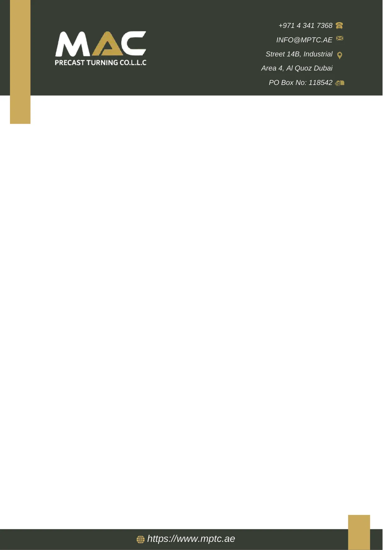
Corporate letterhead for a precast manufacturer
A precast manufacturer selling to contractors and consultants needed a letterhead that read as a serious supplier on quotations and tender submissions, with a header shallow enough to leave room for an actual letter.
- Client
- MAC Precast Turning Co. L.L.C
- Deliverable
- Corporate A4 letterhead, designed and proofed to a printed sample before the run
Paperwork as a credential
MAC Precast sells to contractors, consultants and developers, and those buyers assess suppliers partly on how their documents look. A quotation on a well-produced letterhead reads differently to the same figures in the body of an email — particularly at tender stage, where the document is filed and compared against others.
That is the whole argument for doing it properly, and it is a practical one rather than a vanity one.
Restraint in the header
The instinct on a first letterhead draft is always to make the header bigger. The problem is arithmetic: a header deeper than roughly 45mm starts pushing a short letter onto a second page.
This one was laid out against a realistic block of text rather than an empty sheet — logo left, contact details right, in a charcoal band with a gold accent block breaking the left edge. A matching footer band carries the website and nothing else.
The result is a header that identifies the document and then gets out of the way.
Proofed on paper, not just on screen
The design was printed and checked as a physical sheet before the run. Two things only show up that way: whether the charcoal band reproduces evenly across the full width, and whether the reversed-out white type in the header holds at actual size.
Both are cheap to fix at proof stage and expensive to discover afterwards.